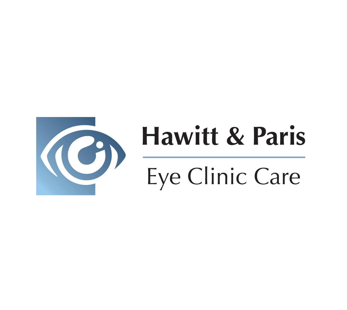

Hawitt & Paris Eye Clinic Care
Logo redesign - Size Varies
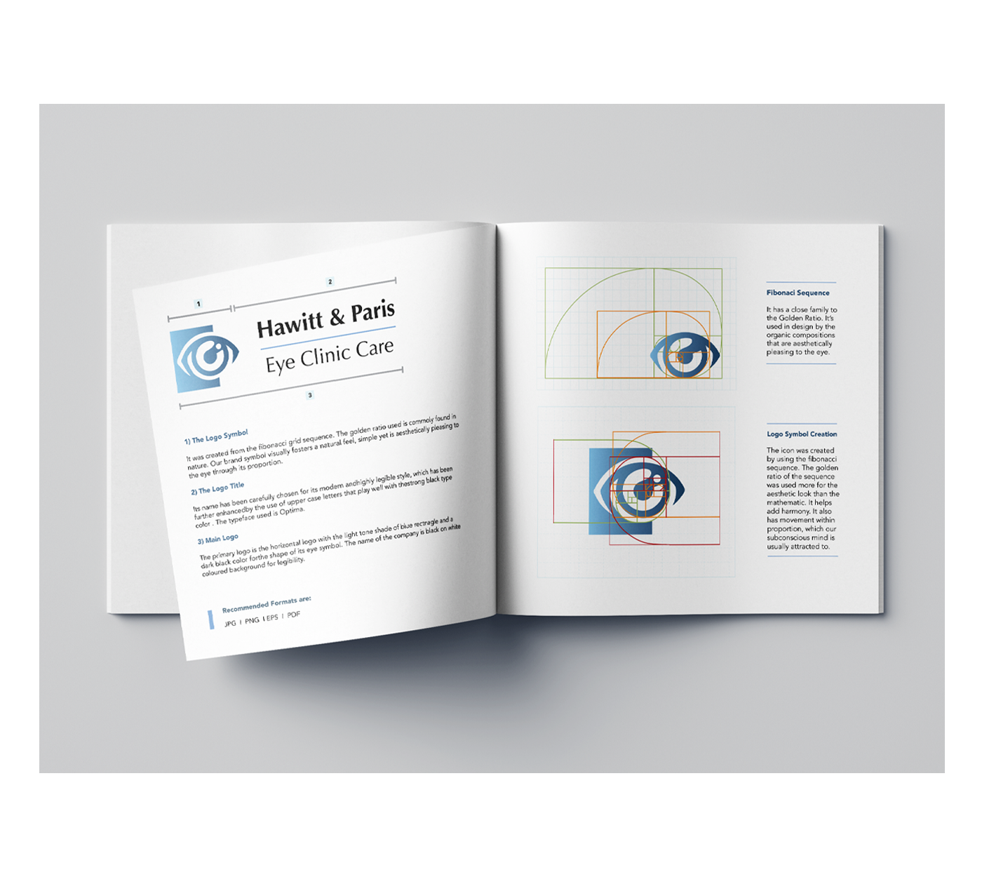
A redesigned symbol and logotype for Hawitt and Paris Eye Clinic Care, an independent medical group that specializes in Ophthalmology. The brand logo includes both primary and secondary logotype. The symbol is derived from the golden ratio. The use of the golden ratio helps create harmony and movement within the proportions, which appeals to the subconscious mind. The abstract organic symbol is aesthetically pleasing to the eye, professional, and trustworthy.
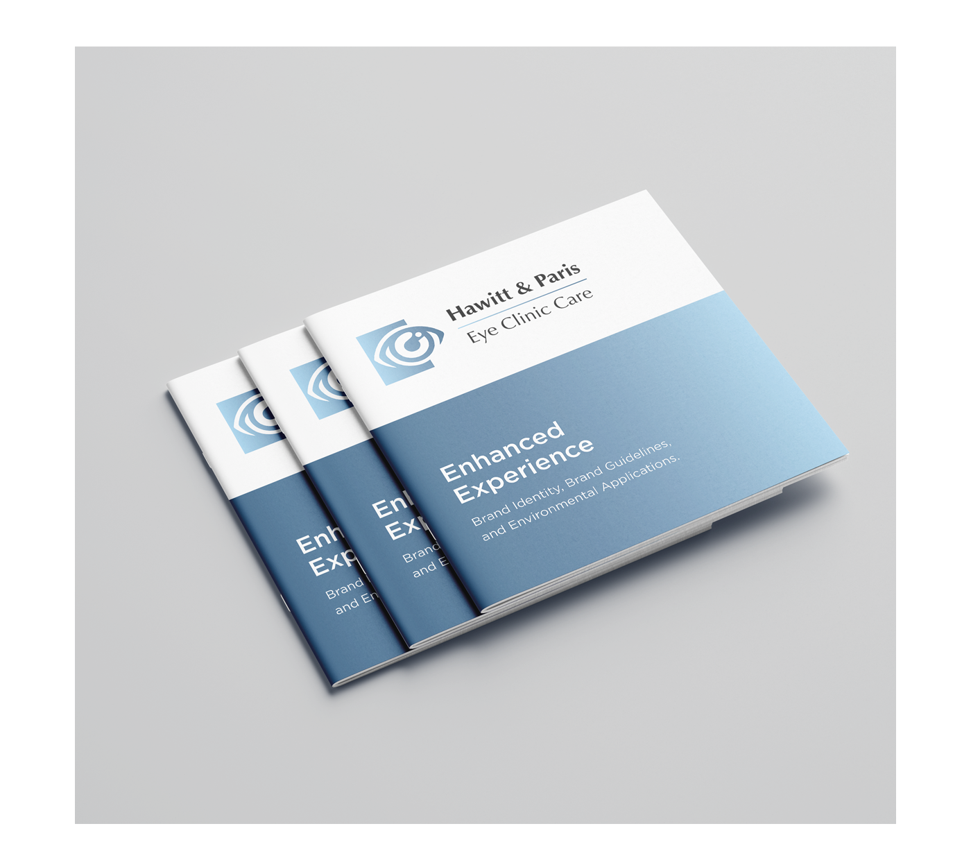
Brand Style Guide - 8 x 8″
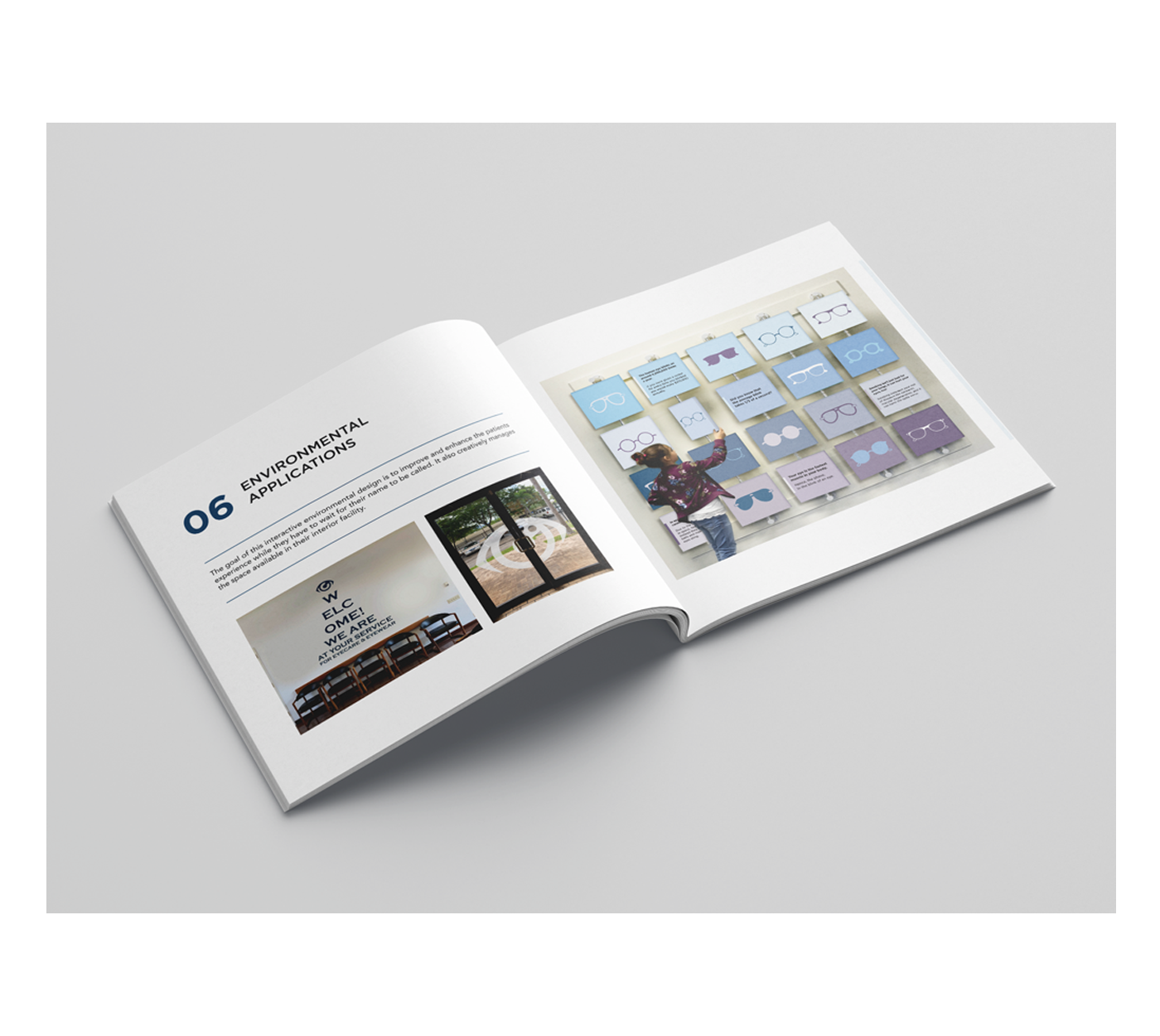
An enhanced brand style guide for Hawitt was created to visually improve the brand’s identity while proposing and implementing environmental design to help enhance the customer’s experience.